

As
![[livejournal.com profile]](https://www.dreamwidth.org/img/external/lj-userinfo.gif) steer
steer and
drplokta pointed out
yesterday, the Nielsen diagram was grossly out of proportion, so it looked like RIM and MS were better than they were.
I passed the data to
steer, who then played around with R (code is in the other post), and produced the second diagram. I've tried to line them up and proportion them with each other as best as I can. So you can now easily see how misrepresentative the original diagram was!
Edit:
Also - an even better one made by
http://9to5mac.com/2012/07/13/nielsen-needs-to-work-on-their-graphics/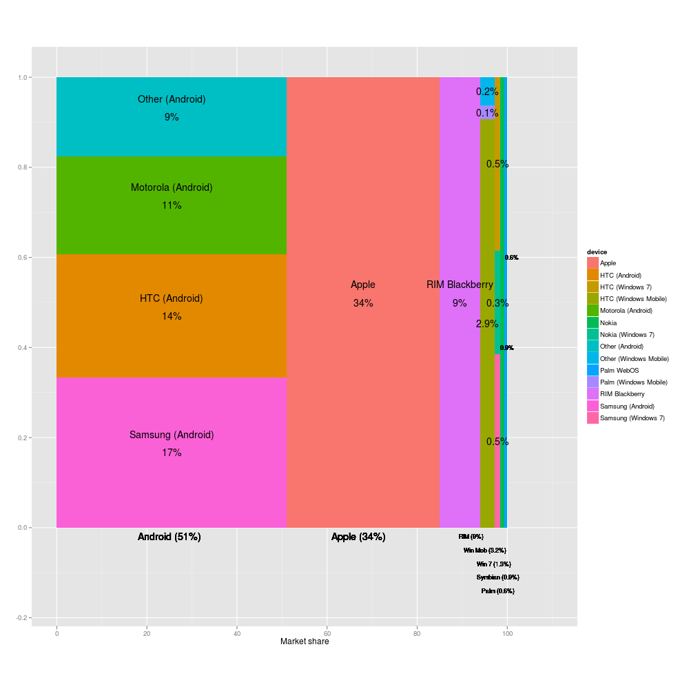
no subject
Date: 2012-07-15 12:45 pm (UTC)http://9to5mac.com/2012/07/13/nielsen-needs-to-work-on-their-graphics/
Incidentally, the part in my previous email about needing a monitor to display a square as a square for the areas to be right was incorrect (a product of working at odd hours and sleeping badly). I constructed the squares that way but if everything changed aspect ratio it would not affect the proportionality of the areas.
no subject
Date: 2012-07-15 12:47 pm (UTC)http://news.ycombinator.com/item?id=4246673
:->
no subject
Date: 2012-07-15 12:50 pm (UTC)I noted some people complaining about "jagged" fonts in the png -- you could link to the pdf if you wanted.
http://www.richardclegg.org/graphics/phoneshare.pdf
no subject
Date: 2012-07-15 08:36 pm (UTC)no subject
Date: 2012-07-15 08:38 pm (UTC)Because it doesn't say that anywhere on it, and that would _also_ be horribly confusing.
no subject
Date: 2012-07-15 10:27 pm (UTC)http://www.asymco.com/2012/02/03/first-apples-rank-in-mobile-phone-profitability-and-revenues/
This data report is from February but using 2011 data, showing Apple with a 9% share of units sold, a 38% share of revenue (consistent with your graph above), and a 75% share of profits.
no subject
Date: 2012-07-15 10:29 pm (UTC)no subject
Date: 2012-07-16 07:09 am (UTC)It is amazing how much the market share has increased in the last year or so - iOS and Android have basically swallowed up all the other operating systems.
Treemapping
Date: 2012-07-15 09:03 pm (UTC)</sloth>
Re: Treemapping
Date: 2012-07-15 09:17 pm (UTC)Re: Treemapping
Date: 2012-07-15 10:47 pm (UTC)I always tell my students, a good programmer is lazy in a clever way.